

So, you’ve finished setting up the website, and it has gone live. But as a UX designer, does your job end there?
No.
As much as each designer and developer strives for a seamless experience upon launch, it’s not always the case.
There will always be slip-ups cropping up every now and then, and time will easily come when site maintenance needs to take place to ensure the quality of the user experience.
Ultimately, your website’s success lies in its ability to meet your business goals while simultaneously keeping users engaged.
The latter goal can be determined truthfully only when you have real users engaging with your website.
Their interactions provide real-time data that you can study to point out specific problem areas that you need to address.
And when it comes to finding good sources of real-time data, most digital marketers immediately run to Google Analytics for insights and clues on how they can improve their website. But for a UX designer, there are specific metrics you need to look at to know which areas need improvement.
How can Google Analytics help you with UX design?
As many people know, Google Analytics is a free service offered by Google and it comes with in-depth insights into your website. For one, Google Analytics lets you see links that people are clicking on, and which parts of your site they’re leaving. In addition, you also get to see how your website is performing.
These types of insights provide you with a starting point where you can begin to correct UX-related issues one by one.
So, without further ado, let’s look at the 6 metrics and insights that will benefit how you do UX design the most:
#1 Event Tracking
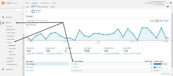
Image Credit: Gravitate Design
Google Analytics’ event tracking tool is useful for measuring the user-friendliness of the links that you have in your webpage.
And according to Google Analytics, events in a webpage are interactions with content that is measurable independently.
In a nutshell, Google Analytics is useful for measuring the user-friendliness of your links.
Let’s say for instance, your button isn’t being clicked. Perhaps it’s not as noticeable as you first thought. If the link close to a CTA button is being hit by accident, it’s safe to presume that maybe the button is too small for people to tap on properly on their mobile screens.
This is handy for tracking video plays, ad clicks, pop-ups, flash elements, and measuring downloads. And depending on the results that your site generates, you can make simple tweaks to the design and do some testing all over again.
#2 Page’s Customer Retention / Session Duration
Your average session duration is the amount of time a user takes to perform a bunch of interactions within a specific time frame on your website.
Average session duration is calculated as Total Duration of GA sessions (in seconds) / Total Number of GA sessions within the same time period.
For blogging sites or websites that have long forms requiring filling out, analyzing this part of user interaction is necessary.
Say for example, longer session durations for blogs mean users are dedicating time to read what you write.
Less time spent on the site can mean revising content or changing formatting to see what will increase user retention and engagement.
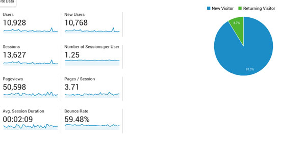
#3 Bounce Rates
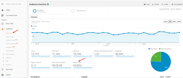
Image Credit: Practical Ecommerce
In a nutshell, bounce rate calculates the percentage of people who paid your site a visit but exited immediately (or bounced) without really doing anything. To put it another way, they didn’t bother clicking on any internal link, navigating the menu, or clicking on the CTA, etc.
High bounce rates could be a sign that means:
- Your site visitor didn’t find what they were looking for.
- They found what they needed and left immediately.
- You need to improve webpage quality, since the two previous scenarios mean that there is nothing in the page that interests them or catches their attention long enough to make them stay.
If the purpose of the website is to inform or to report on any of the latest news, then reflections of high bounce rates aren’t strictly a bad thing.
That’s because after opening an informative new article that interests them, they’ll just close the page after reading, or move on to another article that you have.
So, aside from showing them similar articles they can read, you can give them the option of signing up for your newsletter.
#4 Insights on the Audience
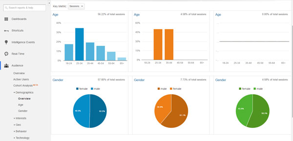
Image Credit: ROI Amplified
Audience insight on Google Analytics is perhaps one of the most helpful pieces of data UX designers can acquire. For one, this report is a breakdown of who your user actually is. Audience insights outline details like interest, location, demographics, devices they use, the recency of a user, frequency, length of engagement, etc.
Need an example about how audience data can help UX designers?
- Location-based: If you find that your main target market originates from a country or region that has English as a secondary language, then you can have translations available — or publish content in their native language with the use of geo-location targeting.
- Time of the day-based: Your visitors are largely midnight visitors. You could provide them with the option of a night mode variation of the app or the site — like what Reddit did.
- Demographic-based: Data that displays insights about your audience’s gender, their interests, and their age will let you experiment on how content is presented in the homepage or landing page.
#5 Behavioral Data
Behavioral data found in behavior flow is a useful metric that lets you peek in on the actual journey that your users take from the moment they land on your website right down to how they explored and if they converted.
With behavioral data, you can find out:
- Your users’ landing page.
- Other site pages they navigated to.
- Whether they’re new visitors or returning ones.
- Which page or section of the website they spent the most time on.
- Which CTAs or links capture their interest the most.
- Whether they converted or not.
Behavioral flow helps you identify which pages brought the highest volume of traffic. This way, you can easily gauge which pages served as bridges and which ones served as conversion magnets.
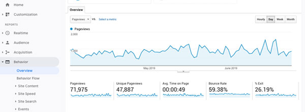
#6 Views on the Page
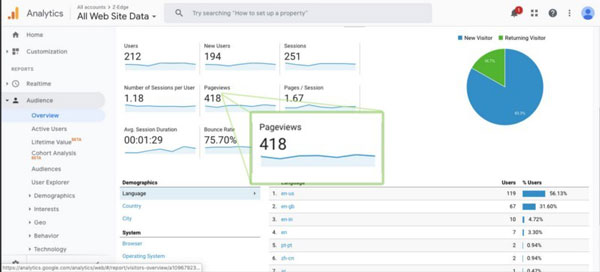
Image Credit: UX Collective
Your site’s number of page views is a good way of measuring user engagement. Technically, the more page views you have, the more your target audiences are engaging with your website. But keep in mind that that isn’t always the case.
Especially keep an eye on how your page views are faring compared to your conversion rates. High page views with barely any conversions entail that your users are moving from one page to another, but they’re not doing anything. It means that your site isn’t answering their needs, and they’re having a hard time trying to find what they’re looking for.
This entails a lot of things in need of tweaking…
It could be a confusing navigating system, a site that has a ton of choices that end up being confusing, or a call to action that’s just not plainly obvious to your user.
Utilize User Data as a Guide to User Testing
The data you acquire from religiously keeping track of Google Analytics is a good starting point for identifying areas of improvement in a website’s UX design. But it’s not going to 100% give you the information that you’ll be needing.
Don’t rule out the importance of user testing.
User testing entails constructing tasks that are commonly performed on your site. You ask a set of users to carry out those tasks and provide you feedback when they’re completed. During that, make careful observations and see where people get stuck or when they slow down.
How you do this varies.
You can:
- Sit with your users in-person
- Conduct video calls
- Employ the use of tools like heatmaps
The prior analysis you’ve gathered will help in narrowing down which pages and which tasks are in need of testing. This way, the process is more streamlined and quick.
Excellent UX Starts with Good Metric Measurement
An attractive site automatically translates to an awesome user experience.
Wrong!
The road to excellent UX design begins with careful measurement and a close eye on the metrics that dictate excellent user experience.
Identifying the right set of key performance indicators (KPIs) to track how user experience is working is essential. With the correct KPIs in place, you can focus on the more important things, and of course, clarify your goals further to formulate a plan for reaching them.
Instead of making changes to your website purely based on guesswork, follow a process that’s driven by data. Tracking metrics helps you create a bridge that links your users’ expectations and your business’ main goals.
Bio: Al Gomez is a Digital Marketing Consultant at Dlinkers. Al has over 12 years’ client digital marketing experience and has a proven track record of successful projects and expertise in various marketing channels. He is passionate about solving online marketing problems like generating leads and increase in sales.