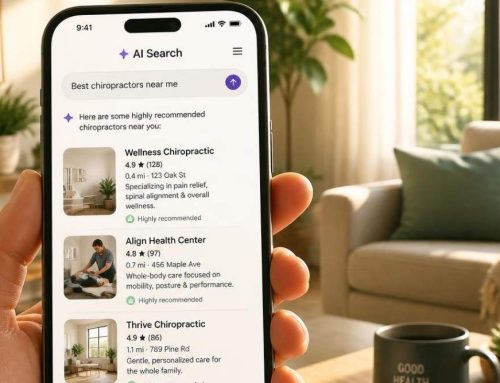

Is your clinic’s website homepage truly working for you—or is it driving potential patients away? Your clinic’s homepage is more than just a digital front door; it’s the first impression that can make or break patient trust. In this episode, we’re diving deep into the must-have elements and strategic tweaks that will turn casual website visitors into loyal patients.
Discover the secret formula behind irresistible homepages, from mastering color psychology to creating seamless navigation that leads visitors exactly where they need to go. We’ll show you how a few simple changes—like a well-placed call-to-action—can skyrocket your patient inquiries.
Plus, we’ll walk you through the mobile essentials your site needs to stay competitive in today’s fast-paced, mobile-first world.
Tune in to learn:
- The key questions to ask yourself to audit your homepage’s effectiveness
- How to gauge your homepage’s performance and make data-driven improvements
- The essential homepage elements that keep visitors engaged
- How to craft a menu that guides your patients effortlessly
- Proven tips to make your calls-to-action stand out
- How to use testimonials to build credibility and trust
- Expert tips for keeping visitors on your site longer
- And so much more! Don't miss this blueprint for transforming your clinic’s homepage into a patient-converting machine.
Selected links and other resources related to this episode:
- Propel Marketing & Design
- Propel Your Practice Podcast
- Book a Discovery Call
- What Should I Include on My Homepage?
- The Ultimate Guide to Google Analytics 4
- 6 Google Analytics Metrics for Creating Better UX (User Experience) Design
- New SEO & Content Marketing Trends You Need to Know
- How Do I Improve My Clinic’s Website Rankings?
- Suggest a topic for an upcoming episode of the Propel Your Practice Podcast
- Free training: Five SEO Secrets to Owning the First Page of Google Without Buying Ads
- Propel Your Practice YouTube Channel
Listen to the audio version:
Listen on...


Watch the video version:
Podcast Transcript - Homepage Checkup: Does Your Clinic’s Website Attract Patients?
Today, we are chatting all about the homepage of your clinic's website. Asking, does your homepage pass the test when it comes to first impressions?
I think we all know how very important the homepage of your website is. After all, usually, whenever somebody ends up on a website, and they're looking around, even if they don't automatically land on the homepage, they usually jump over to the homepage and take a look at it.
And if you look through your Google Analytics, you'll see that your homepage is most likely one of the most visited pages on your website, if not the most important. On top of that, a recent statement from Google really showcases the importance of homepages, so I don't think it's any surprise that it's something that we wanted to tackle on the show.
So today, we're gonna talk about what actions you can take to improve your homepage, some things you can look at to determine if should you add some things to the homepage of your website, should you remove some things that are currently on your homepage of your website?
And my first tip for you is to get a fresh set of eyes on your website. Ask somebody to take a look at your website on both desktop and on their phone, and ask them if they can tell what it is and what your clinic offers as soon as they land on your website.
Are they able to get to key elements, key pages to book an appointment, to take the action that you truly want them to take when they arrive on that homepage?
Now it can be a little tricky because I think we all have this vision of the content that exists on our website. And I know this to be a fact because day in and day out, we speak to clinic owners, and they're like, “I know it's somewhere on my website…,” or, “Well, it says it there…” But, it’s key information that should probably be up higher or more prevalent, and instead, it's kind of buried down deep.
We wanna make sure that you realize that people who visit your website have short attention spans. And so we wanna provide them with key elements that they need, to make sure that they have a good user experience.
We also call user experience UX, which is short for user experience. It's an overlap when it comes to SEO and website design and usability and all of these things, and so that is what we're kind of diving into today, specifically as it relates to your homepage.
So kind of talking your way through the homepage. When you first land on the homepage of your website or, for that matter, any page of your website, your logo should be easy to read and clear to see.
There has been this change over the past couple of years where people have, have like, a translucent header where their logo is sitting on top of some action behind it. Whether it's a video or maybe it's even just a still image, but sometimes when you put your logo on top of that, it can be really hard to read.
So we wanna make sure, step one, can somebody identify your logo? Is it too big? Is it too small? If it includes a tagline, is it easy to read? Check, check, and check.
Once we have solidified the fact that somebody can clearly read your logo, then we wanna move on. But before we do, if your logo, for example, that I just recently mentioned, if it's sitting on top of an image or on top of a video and your logo is in color, doesn't it make more sense to have your logo be a solid color?
We've seen just that simple change make a website pop because of the fact that then you can easily see the logo.
And while we're talking about colors, we wanna keep them clear and concise. And, yet, have some of those calls to action–the actions that we actually want somebody to take on the website–we want those sometimes to be a different color so that they stand out.
So maybe if your color scheme is blues, then your call to action is an orange or something like that, just so it's clearly a big pop. This is where we click to book an appointment as we continue our way down the homepage.
Let's talk about the menu that's at the top of the homepage. In most cases, your menu is going to appear differently if you're on a desktop version of your website, looking at your clinic's website, versus a mobile version, and you might even need to adjust the menu on a mobile version.
For instance, if I am looking at the desktop version of your website and you have a number of drop down menus. So when you hover over specific elements of the top menu, you might have drop-downs, right? It might be Conditions, and then it drops down, and it lists a bunch of conditions. Well, it could be that that is difficult to display on mobile.
So instead of having all of the drop-downs, you might just want the top menu that goes to a conditions page. From there, you can click on others, and I'm speaking specifically to mobile for that element, not to just simplify the menu on your desktop because when people are on a desktop, they're more likely to hover over something to scroll down more to take further action.
So you wanna look at your website on both the mobile and the desktop.
So, moving on down on your homepage. Typically, the next segment that we see on a homepage is the hero section, whether this is a video or a set image, or maybe images on rotation.
We wanna make sure that when somebody sees those graph, the graphics that are there, that they're able to directly understand what it is that you offer. And the top section of your website is called above the fold, so before you have to scroll down to reach other sections, we want it to clearly identify what you offer.
So that means, even if in your tagline, on your logo, it says chiropractic care or sports chiropractor in Cincinnati, or anything like that, we actually want some of those key elements in the written words that are on your website.
And another thing that we want to note is the location, which I kind of already just alluded to. But we want somebody to know where you're located when they get to your website, and whether that means that your address is in a header bar above your logo or in that hero section you say proudly serving name-of-city, or however you want to display it.
We wanna make sure that somebody knows exactly what it is that you offer when they get to your website. Sometimes, when people use some of the canned content that companies put together, their website seem to not exactly represent the services that they offer, but maybe just the location.
We've seen this happen a lot where, specifically, we go to a chiropractor's website, and it might be a picture of the city where the office resides, which is nice, but it looks more like a tourism website than an actual chiropractic clinic.
So keep that in mind. The images that you use hopefully are not sock photos. They're photos that are actually taken at your location and, again, tell the story about what it is that you offer.
We also want to make sure that that header section, that hero section, isn't taking up too much space because, again, you're going to have to scroll or swipe if you're on a phone to get down to the content below it. So you do usually have the ability to make that section a little shorter.
I mentioned before that a lot of people use videos in that section, and that's actually kind of starting to be something that's being phased out. I think you're going to see more of that phased out in 2024 if I had my predictions, and you're going to see more stagnant images or even multiple images all displayed at once.
If you are going to use a video in that section, you do want to make sure, and really in general, when you have a video on your website, that it's pulling from YouTube or that it's pulling from a source, it isn't just the video loaded directly to your website, because it can really really slow things down.
We already talked about it, but I do want to mention it again; we want clear calls to action. I've seen websites of clinic owners where there are two calls to action, or maybe it's not so clear.
Do you have a big orange button that says “Buy Supplements,” but you really want your true call to action to be for somebody to book an appointment? If you want somebody to book an appointment, then we want that to be the main call to action, and not get; we don't want people to get distracted with other calls to action like to download a PDF or, again, to purchase supplements, or to take any other actions that aren't in alignment with what you really, truly want them to do when they're on your website.
If you take insurance, if you are a chiropractic clinic, for example, and you take insurance, and that seems to be important to people that are coming through your doors, we want that, again, obvious on the homepage that you accept most insurance and then maybe add a link “Click here for a complete list” that goes to a different page.
You also want to make sure that people from your homepage know what services you offer and what conditions you treat. You can have different sections on your homepage that highlight each of those.
Are you asking people on the homepage of your website to sign up for a random newsletter without giving them any reason? If so, most likely, people aren't.
So if you do want a secondary call to action to start collecting email addresses, I think that's great, but you want to give them a reason to do that, not just ask them to sign up for your newsletter. That's a little too general, and, again, it's not a very strong call to action that's going to get people to sign up.
A lot of people these days are stepping up, and they're including testimonials on their homepage, which I love and absolutely think you should do, but personally, I don't like the automated widget that pulls them directly from Google.
I like to see true testimonials that really help showcase what your company offers as actual text on the homepage instead of the little auto-populated ones that grab out randomly or were the most recent reviews from Google, where you don't have as much control over what you're showcasing.
On this show, we talk a lot about SEO, and there are a number of episodes that will be in the Show Notes that reference specific SEO elements, like making sure that your website loads quickly; this is absolutely imperative for your homepage, making sure that you're using H1 tags and H2 tags the proper way, making sure that you're using the proper keywords on the homepage of your website because, again, that is going to be one of the most frequent website pages viewed.
I am also a fan of adding your social media links to the bottom of the page instead of at the top. The reason for this is if somebody lands on your homepage, you want them to take an action on your webpage. You don't want them to get distracted by clicking on your Instagram link, going over to Instagram, and not coming back to your website.
So I do suggest that you move those social media links down to the bottom of your website. If you do want to keep them at the top, that's not a big deal, but I would have them make sure that they open up in a new window so that, if somebody does get distracted and start looking around a social media site, that you still have your website open in a different window for them to come back to.
Also, we want to make sure, that if you want somebody to call you to book an appointment, you want to make sure that the phone number is clickable. So many people, again, are using mobile devices, so I suggest that you have click-to-call options where somebody can easily click on the phone number, and it will call you.
As we talk about ease, we also like to see address, map, and hours–if you want to showcase your hours, I can understand why some people might not want to showcase their hours, but if you do want to showcase your hours of operation, your homepage is a great place to do that.
But you definitely want to include a map and the physical address, and the map should be clickable so that if somebody is looking you up and on their phone, they can click through to get directions.
If your location requires some additional information on how to get to it, for example, if you live in a big city and you want to make sure that somebody knows what stop to get off on the subway, or if you have awkward parking, or if you want to showcase the fact that somebody should park in a specific parking lot, I like that information included by the map and your address.
We want to make sure that somebody can find your location with ease, so providing that additional information will make it easier for them to get to your physical location, which will put them in a better mood when they check in and it will help them to have a better experience with your business, and hopefully, that will lead to them leaving a nice review towards the bottom of your website.
We call the bottom section your footer, and there, you want to make sure that throughout your website, you include your copyright information, links to terms of use and privacy policy, and anything else that you need to provide information-wise. That does not need to be at the top of the page.
So we covered a lot today. I'm just going to kind of go over some of it as a refresh:
- We suggested that you get a fresh pair of eyes on your website to make sure that somebody understands exactly what you offer.
- We talked about adjusting your menu, if need be, so that you have a different mobile menu version than you do for your desktop.
- We talked about how to handle the hero section of your website, making sure that it showcases who you are, what you offer, and who you offer it to, including the areas that you offer it.
- We talked about if you offer insurance, you might want to mention that and make that easy to understand and for people to access that information.
- We want to make sure that all elements on your website are easy to get to from your homepage.
- We want to make sure that when people are there, that they understand what services you offer, what you treat, what conditions you treat.
- We want to make sure that you include testimonials for social proof.
- When it comes to being social, we suggest that you have your social media links down towards the bottom of that page.
- We want to make sure that your homepage loads quickly, that visitors have a good user experience.
- That your phone number is clickable, so people can click to call when they are on their mobile device
- That you have a map that makes it easy for people to find you.
- And, again, that you follow all best SEO practices,
- Along with keeping legal information and copyright information, those links down in the footer of your website.
That's it for today. We would love to hear from you. Please visit us on Instagram @PropelYourCompany, send us a direct message, and let us know what topics you would like to hear about in upcoming episodes. Thanks so much for your time today.

Darcy’s SEO strategies are easy to implement and effective. She’s the #1 SEO expert I refer to whenever I need help with my rankings.
SEO queen! I can’t thank Propel and Darcy enough for holding my hand through the SEO process! I’m loving the podcast and all the insight! Also loving that my business is now getting the brand awareness and sales I’ve always wanted!
Wow! Clear, concise and impactful. Excellent details and tips - already seeing a return!! Worth the 20 min listen.
Get our next podcast episode delivered directly to your inbox:
We'll email you when we release new episodes.
Sponsors
This episode of the Propel Your Practice Podcast is brought to you by Propel Marketing & Design. Propel Marketing & Design helps Chiropractors, Acupuncturists, Physical Therapists, Wellness Practitioners, and other clinic owners improve their website rankings.
Do you have a suggestion for an upcoming topic or guest?
We love a good suggestion and we’re happy to take yours! Tell us about a topic you want to hear more about or a guest you think would make an impact here and we’ll take care of the rest.
Interested in sponsoring a Propel Your Practice Podcast episode?
If your organization would be a good fit for our target audience, we’d love to work with you. Hit the link below and let’s talk.