
Your clinic's website is the digital front door to your practice, making it essential to create an exceptional user experience (UX) for every visitor. Yet, some website elements may unintentionally hinder performance, turning potential patients away.
In this episode of The Clinic Marketing Podcast, we reveal 12 things you need to remove from your clinic website immediately—and explain why letting them go is critical.
By addressing these areas, clinic owners can not only enhance their website's UX but also improve search engine optimization (SEO) and attract more patients.
The ultimate goal? To design a digital space that reflects your clinic's brand while inspiring, informing, educating, and engaging your audience. Tune in to make your website a true asset to your practice!
Listen to the podcast episode:
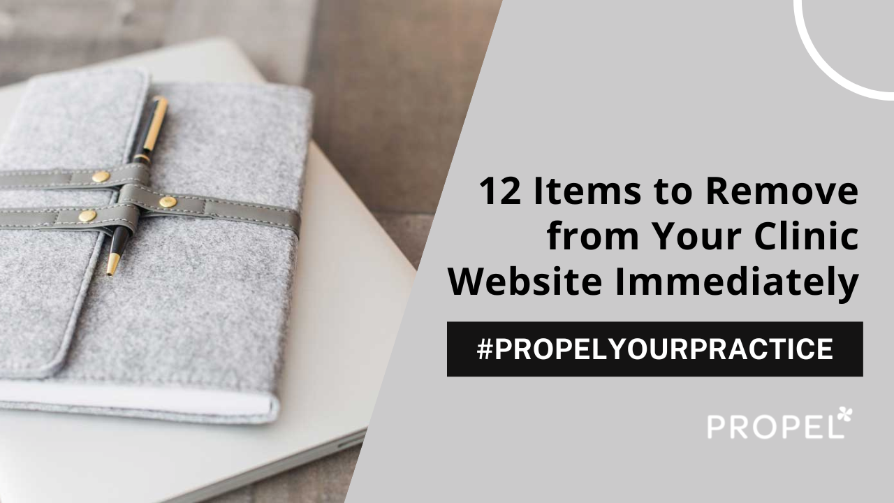
Website Wellness: 12 Items to Remove from Your Clinic Website Right Now
When it comes to establishing a strong online presence for healthcare clinics, the balance between an inviting website user experience (UX) and a strong search engine optimization (SEO) campaign is critical.
A well-crafted website serves as the digital front door to your practice, setting the tone for patient engagement and ultimately determining the success of your online efforts. So, you have to ensure the right stuff is on it (and the wrong stuff is off it).
What to Remove from Your Clinic’s Site Today
Websites have come a long way, and with Google’s constant algorithm updates, staying on top of your website’s performance is vital.
What are some good ways to do that?
Like this:
Say Goodbye to Homepage Slider
Homepage sliders may seem like a dynamic way to showcase multiple messages or promotions, but they often lead to user confusion and distraction.
Most users tend to ignore them or find them annoying, resulting in a poor user experience. Instead, focus on a clear and concise message that instantly communicates your clinic's value.
Convey Clarity Using Headers
Clear and descriptive headers are essential for guiding visitors through your website and its pages, helping them quickly find the information they need. Vague headers create confusion and frustration, leading to high bounce rates (when they leave the website).
Ensure that your headers accurately reflect the content they lead to; this improves the UX and adds to your successful SEO.
Remove Social Media Icons from the Top of the Website
Placing social media icons prominently at the top of your website can distract visitors from your primary call to action, which is to engage with your clinic from your site.
Include social media links in the footer or contact section of your website to keep the focus on your core services and give visitors the opportunity to take the on-page actions you want them to.
Avoid Headache-Triggering Design
Elements such as bright colors, tiny fonts, and fast-loading videos can cause visual discomfort and even headaches for some users. Opt for a clean and minimalist design with legible fonts and consider the accessibility needs of all visitors to your website.
Use Unique Images
Using generic stock photos that look similar to your competitors can dilute your brand identity and fail to establish a unique connection with your audience. Invest in high-quality, authentic imagery that reflects the genuine experience and atmosphere of your clinic.
If you’re planning a photoshoot, check out the podcast we created on planning the perfect photoshoot.
Optimize Video Libraries for Load Speed
Video content is a powerful tool for engaging visitors, but if your video libraries take too long to load, users may become frustrated and abandon your website. Optimize video files for fast loading times and consider hosting videos on third-party platforms like YouTube or Vimeo.
Avoid Low-Quality or Duplicate Content
Canned content or duplicate content not only damages your website's credibility but also harms your SEO efforts. Invest in original, high-quality content that showcases your expertise and provides valuable information to your audience.
You are an expert, so give that expert advice through content that resonates with your target audience.
Transform PDFs into Web Content
PDF content can be cumbersome for users to access and may not be mobile-friendly. Convert PDFs into web-friendly formats or integrate the content directly onto your website for improved accessibility and user experience.
Note that you still need to create unique content. So, if you purchased a laser therapy machine and were provided a brochure about it from the seller, you don’t want to create a web page that copies that brochure word for word.
Silence Auto-play Videos
Autoplay videos with sound can disrupt the user experience and annoy visitors, especially those who are browsing in quiet environments. Allow users to control video playback and mute options to respect their preferences and enhance usability.
Purposeful & Timely Pop-ups Only
While pop-ups can be effective for capturing leads or promoting special offers, overly aggressive or intrusive pop-ups can drive users away from your website. Use pop-ups sparingly and ensure they are timed and targeted appropriately to avoid annoying your visitors.
For example, if you want someone to sign up for your mailing list, be sure to have that appear at the right time in the visitor’s journey.
Combat Broken Links
Broken links not only frustrate users but also harm your website's SEO performance. Regularly audit your website for broken links and redirect them to relevant pages to maintain a seamless browsing experience for visitors.
Check out this tool that will help you find broken links fast.
Simplify the Next Steps with Clear Calls to Action
Cluttered or unclear calls-to-action (CTAs) can confuse visitors and hinder conversion rates.
Streamline your website's conversion process by strategically placing clear and compelling CTAs that guide visitors towards desired actions, such as booking appointments or requesting more information.
This helps eliminate distractions and optimizes the user journey to maximize conversion opportunities and drive your clinic’s growth.
12 Ways to Quickly Contribute to a User-Friendly & SEO-Friendly Clinic Website
By removing these 12 elements from your clinic website, you can improve user experience, enhance brand credibility, and drive those conversions.
Take the time to evaluate your website and make necessary adjustments to ensure it effectively represents your clinic and provides value to your visitors and your SEO strategy.
Want to learn more? Book your free discovery call with Propel today.
Related Resources:
First Impressions: Does Your Clinic’s Homepage Pass the Test?
31 Horrible Website Mistakes You’re Making and How to Fix Them
Website Wellness Video: 12 Items to Remove from Your Clinic Website Right Now
Click to play
12 Features Hurting Your Website’s Performance (And How to Fix Them) | Ep. 89Transcript
Today, we're doing a little bit of website rehab as we dive into 12 things clinic owners must remove from their websites immediately.
So this week, today is Thursday; I had intended to record this episode on Monday but got a nasty cold. As you can tell, I still have a little bit of congestion, so I apologize for that.
But in the past three days: Monday, Tuesday, Wednesday, we still did a number of discovery calls with clinic owners. And during these discovery calls, I can tell you the 12 of the things that we're sharing today, the 12 things clinic owners must remove from their websites immediately; I saw repeatedly this week.
Now, if you are a clinic owner and you're interested in us looking at your website and letting you know how we can help you from an SEO and user experience direction, you can visit propelyourcompany.com and click book a discovery call.
As a clinic owner, you know the importance of your website. When people go to your website, we wanna make sure that they have a great experience, user experience we call this UX, and that they take the actions that we want them to take, and today, that's what we're diving into.
So up on the list of number one for the 12 things that you should remove from your website immediately is the old-fashioned homepage slider.
While a homepage slider might seem like a dynamic way to showcase multiple messages or promotions at one time, it can often leave the visitor feeling confused or distracted. And, let's be honest, nobody is clicking through to go from slide to slide to slide.
Instead, focus on having a clear and concise messaging and including imagery that reflects that messaging.
Number two, vague headers, and this is extremely, extremely important on your homepage.
We've talked about this before, but if your header- if somebody arrives on your website and your header is just like, um, “Helping you feel better,” well, that doesn't let me know what you do or where you offer your services.
Versus something like “Providing Chiropractic Care to the Greater Nashville Area.” See how, in the clearer heading that I understand what you do, you can have a subheading that goes into more detail, but we wanna make sure that your headers are very clear to help ensure accuracy of who you are and what you offer, especially on that homepage.
This leads us to number three. We want to make sure, when people come to your website, if they do not feel good, that you do not make them feel worse. This means if you are a chiropractor or a massage therapist, or a physical therapist, if you are anybody who deals with potential patients who could suffer from headaches, we do not want to make their headaches worse when they visit your website.
As someone who suffers from migraines, I can tell you there are so many times when I visit clinic websites where my head feels worse because they've used maybe aggressive bright colors, tiny font, or they've got fast-loading videos or things that visually add more discomfort and increase my headache.
So make sure when you're putting together your design—again, this goes back to that slider that we had already talked about—that these elements don’t have the opposite effect of what you truly want to happen when somebody comes to your website.
Number four, when somebody comes to your website, you want them to stay on your website, and while social media icons are amazing, we do not want them placed at the very top of the website.
Placing them at the top of the website can be a distraction. Somebody can come to your website and, as soon as they're thinking about making an appointment with you, see your Instagram icon at the top, click on it and get distracted, and never come back to your website again.
All right, onto number five. Number five is using stock photos that resemble your competitors. Obviously, we don't love the idea of using stock photos, but I get it. Sometimes you have to, and if you do need to use generic stock photos, which can happen, just make sure, when you're on a website searching for the stock photos, that you don't use the ones that are sorted by most popular, because those are the ones everybody is going to be using.
Ideally, it's preferred for you to use unique photos that really, truly represent your brand, and if you are planning a photo shoot or considering planning a photo shoot, please be sure to check out the podcast we created on planning the perfect photo shoot to ensure that your images from a photo shoot will be website-ready.
All right. Number six Slow-loading video libraries.
Oftentimes, clinics like to include video libraries as an asset on their website, which is awesome. Love that idea. Now, I'm not referring to a video library that's powered by an outside source. I am referring to when people specifically load websites or load videos to their video library instead of loading them to YouTube or Vimeo and then embedding them.
Oftentimes, too, what can happen is that if they do load them to a third-party platform and then embed them, which is the way to handle that. If they do too many on one page, it can slow things down, so keep that in mind if you feel like you want a video library.
There are a number of different ways to handle this. One, test how quick the load speed is, right? To make sure that it looks correct and that it modifies itself so that if somebody's looking at them on a, looking at your website on a cell phone, that the videos don't get cut off. That can be an issue as well. So you wanna make sure that they display correctly and that they load quickly.
If you come to an instance where, again, you're not loading these videos directly to your website, you're loading them, preferably to YouTube or Vimeo; if you load them to YouTube and then you've got a page full of videos, and you feel like they're still a little slow, what you can do is organize them in a way where you have them grouped by category.
So, let's just say you have back pain, neck pain, shoulder pain, et cetera as your groupings. Embed the most popular one, and then under it, include the link to the other videos associated with that library. That's one way that you can keep a nice, clean look and feel.
The other option, which a lot of people are using, is to instead link the tab that says videos to your YouTube page. And if you decide to go that route, what I would suggest are a few things. One, that you have that link open in a new window so that if somebody leaves your website and goes there, that your website tab is still open. And then two is that, within YouTube, that you create a playlist and that you have things nicely organized and nicely labeled so people can find what they're looking for.
Okay, number seven is low-quality or duplicate website content. A while back, we did an episode on canned content and how to handle canned content. You can jump back and either look in the Show Notes for this episode or search “canned content” in the pod–through the podcast and find that episode.
But we wanna make sure that you're not creating content just for the sake of content, or that you have duplicate content, or that you have very vague content that really isn't original to your business and doesn't showcase what you actually offer into your personality.
Number eight is PDF content that should be web content, and I've got a couple examples of this.
One would be a flyer. Like, you don't wanna take a flyer PDF that maybe showcases a new service that you're offering and just take that and put it on a page on your website and think that all of a sudden Google is going to find you for the terms that are on that graphic, even if you convert it to a JPEG.
So we could actually even say PDF content that should be web content or images that should actually be web text content.
We wanna make sure that you convert that content into a web-friendly form and integrate it into your website to help you with the findability factor. That doesn't mean that you can't link to the PDF. It just means that you should actually have that text on your website and laid out in a way that Google can find it and that it's optimized and easy to read.
Now, this does not mean that, for example, if you are a chiropractor and you recently purchased a laser, that you take the laser brochure that was provided to you from another company and just, word for word, use the exact wording that they supplied on that PDF or brochure and turn it into website content.
You wanna own that content. Again, this goes back to number seven you wanna make sure that it's not low-quality, low-quality content, that it's content that actually reflects your brand and your offerings.
Okay, number nine, auto-play videos with sound. Ooh, this one's the worst.
Think about it. Let's pretend that you are at work, sitting in a cubicle, and supposed to be focusing on one thing. Instead, you go to a website because you're looking for something else, and all of a sudden, a video starts playing that you shouldn't be listening to. So we want to make sure that you don't have videos that auto-play with sounds.
Number 10, pop-ups that don't serve a purpose. If I'm coming to your clinic's website for the first time and I don't know much about your organization, there's no reason that I'm gonna just want to generically sign up for your email list.
So having aggressive pop-ups that just say sign up for our email list is really not effective and, in fact, again, provides a bad user experience.
Instead, if you are going to include pop-ups, have them with a purpose. So what does that look like? Well, maybe if I am on a blog post that talks about something related to running injuries, a popup might be getting our, I don't know, video collection, or sign up to receive our three stretches to help you prevent injury before you run, something that actually relates to the content that's on that page, right?
So this might mean if there is something on a back pain page that then the popup content relates to, sign up, to get fill-in-the-blank that relates to the problem, which would be back pain.
Again, we wanna make sure that we're not using just those vague pop-ups of sign up for email list without giving them any reason why to sign up for your email list.
Next step, broken links. Broken links are frustrating and they're bad for SEO (search engine optimization). So regularly, you wanna do an audit of your website and make sure that you don't have broken links internally and links that are linking outside of your website that are also broken.
One of the easiest ways to do this is there's a handy, dandy-free tool at www.brokenlinkchecker.com where you can simply enter in your website, and it'll spit out a list of any broken links.
And finally, ooh, and this one I saved it for last for a very good reason. It is one of the worst user experience items that directly correlates with getting people in your front door, and that's conversion confusion.
And let me repeat that again: conversion confusion. This is when you go to a website, and there's multiple actions that you can take, not just oh, you can click on different pages of the website, and there's a menu structure that has different links. but where it has buttons that are “book an appointment,” “book a free assessment,” “schedule a call,” when there's too many options all on one screen at the same time, it gets very confusing, and this also I see this a lot too with again those social media icons at the top of the page.
So yesterday, for instance, I was on a discovery call with a chiropractor, and we were looking at their homepage and in their homepage, above the top menu, they had a call to action for a free assessment.
They had a button, but it was the phone number, which was a click to call, and then they had the social media icons, and then below that, they had the traditional header menu with then a call to action to book an appointment and then in there luckily they didn't have a slideshow, but they had a huge hero image with text, vague text that didn't state their location or exactly what they did.
And then two calls to action there, and all of a sudden, the person visiting your website is like, “What do I do? What do I do for this?” And on top of that, they were a clinic that offered, well, they were a chiropractic clinic, they also offered additional non-chiropractic services.
So somebody landing there just expecting to see chiropractic information is like, “Wait, there's a call to action to take this or for this service at the same time as a call to action to book a chiropractic appointment.
It can be very confusing. So if you just kind of keep it easy with a “book now” button, or, obviously, if you are on specific pages where you're diving into specific services that you offer, really clear actions are defined of what you want people to take.
So, in conclusion, by removing these 12 website issues that we commonly see, you can improve the experience for people when they come to your website, increase your brand credibility, and drive more conversions.
So take the time to evaluate your website and make any necessary adjustments to ensure that it is effectively representing your clinic and the value that you provide your visitors, patients, and potential patients.
And again, let's go over, let's wrap it up with reviewing what those 12 items were, that would be:
- Your homepage slider
- Vague headers
- Social media icons at the top of your website; again, they're absolutely fine down at the bottom, but let's not keep them at the top
- Headache-triggering elements: crazy colors, tiny texts, fonts, fast videos, those types of elements
- Image issues that include using stop photos that look just like your competition
- Video libraries that take too long to load
- Low-quality canned content or duplicate content
- PDF content that should actually be written content on your website, and again, the same thing can go for an image that should actually be written content on your website
- Auto-play videos with sound
- Pop-ups without a purpose
- Broken links
- And finishing it off with that conversion confusion
We would love to hear from you as to what topics you would like to hear from us coming up and what issues you are currently having when it comes to your website, SEO and content marketing.
You can find us on Instagram @propelyourcompany, and again, if you're interested in signing up for us to take a look at your website and chat about how we can help you improve your website and SEO, please visit propelyourcompany.com to book a discovery call.
Listen on...


Get our next podcast episode delivered directly to your inbox:
We'll email you when we release new episodes.
Darcy’s SEO strategies are easy to implement and effective. She’s the #1 SEO expert I refer to whenever I need help with my rankings.
SEO queen! I can’t thank Propel and Darcy enough for holding my hand through the SEO process! I’m loving the podcast and all the insight! Also loving that my business is now getting the brand awareness and sales I’ve always wanted!
Wow! Clear, concise and impactful. Excellent details and tips - already seeing a return!! Worth the 20 min listen.
Sponsors
This episode of the Propel Your Practice Podcast is brought to you by Propel Marketing & Design. Propel Marketing & Design helps Chiropractors, Acupuncturists, Physical Therapists, Wellness Practitioners, and other clinic owners improve their website rankings.
Do you have a suggestion for an upcoming topic or guest?
We love a good suggestion and we’re happy to take yours! Tell us about a topic you want to hear more about or a guest you think would make an impact here and we’ll take care of the rest.
Interested in sponsoring a Propel Your Practice Podcast episode?
If your organization would be a good fit for our target audience, we’d love to work with you. Hit the link below and let’s talk.