
Responsive design is Google’s recommended design pattern.
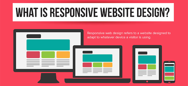
Responsive web design: Serves the same HTML code on the same URL regardless of the users’ device (desktop, tablet, mobile, non-visual browser), but can render the display differently (i.e., “respond”) based on the screen size.
Check out the infographic below for more details.