

Need a boost in your site rankings?
Google demands Responsive Websites from 81% of websites!
Is your website responsive?
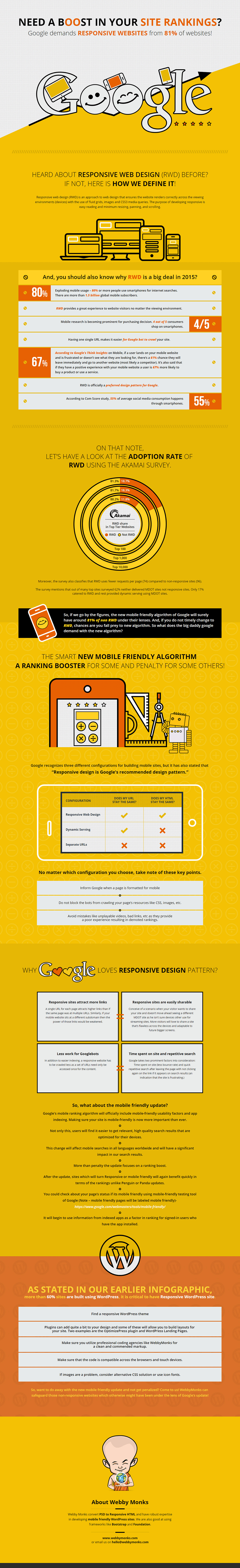
Responsive web design (RWD) is an approach to web design that ensures that the website renders correctly across the viewing environments (devices) with the use of fluid grids, images and CSS3 media queries. The purpose of developing responsive is easy reading and minimum resizing, panning, and scrolling.
Why is responsive web design such a big deal?
- 80% or more people use smartphones for internet searches
- RWD provides a great experience to website visitors no matter the viewing environment (device)
- 4 out of 5 customers shop from smartphones
- Having one single URL makes it easier for Google bot to crawl your website
- According to Google’s Think Insights, if a mobile user lands on your mobile website and is frustrated or doesn’t see what they’re looking for, there’s a 61% chance they’ll leave immediately and go to another site. It also said that if they have a positive experience on your mobile website a user is 67% more likely to buy a product or use a service.
- Responsive web design is officially a preferred design pattern for Google.
See the infographic below for more details.
Want a website review? Click here to have Propel review your website.
Related Bonus Material
Grab Your Copy!
Get more insight download the 9 Steps to a Successful Website Campaign Blueprint.